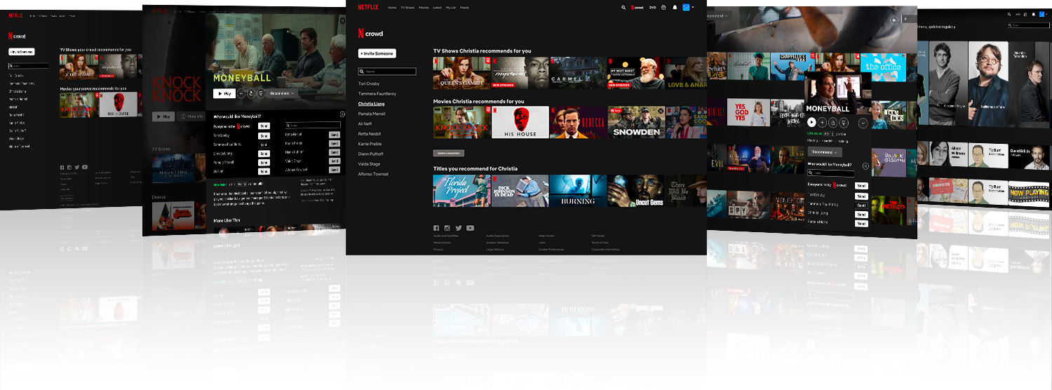
Making movies a shared experience - even when streaming - Netflix has a prime opportunity to connect friends through shared recommendations and to help them choose from an overwhelming amount of options.
Known for pioneering movie-streaming, and for changing the entire entertainment industry, Netflix's main priority is increasingly engagement. Netflix's main priority is engagement. Users can cancel at any time, and the competitive landscape is increasingly crowded. And while Netflix has been successful in churning out popular content, the sheer glut of options for users can make it difficult - even daunting - to figure out what to invest their time in. The idea is to solve the Netflix problem of upping engagement, by addressing the user problem of choosing what to watch.
I hypothesized that users would like to be able to share recommendations on Netflix. It would give them a shared experience to discuss, and would make choosing what to watch easier. In particular, a study has described the community and expression benefits that some women get out of being immersed in forums about this kind of content, and I see no reason to assume that men wouldn't benefit similarly. Another assumption was that people enjoy watching TV shows at the same pace as their friends, so that they can discuss the narrative progress and avoid spoilers.
Caveat: I'm a bit of a film geek. I've been in the industry for ten years and have an MFA in filmmaking. If ever the "average user" was likely to behave and think very differently from myself, this would be the time. So to stay focused on the "average user" I created one that represented my assumptions in designing this feature. Meet Kevin...
“When I watch something I really like, I I want everyone else to see it. I know what my friends like, and I trust some them - okay, some of them - to recommend what I should invest my time watching.”
Before getting too deep into it, I wanted to see if any of Netflix's competition was doing something along these lines - or any - to affect engagement. The most direct competitors - Hulu, Amazon, and HBO Max - didn't have any social features at all. Once I expanded the scope of my research, however, I found a few more items worth looking at.
Allows users to synchronize viewing remeotely with friends, with a text chat function to communicate live through out.
Allows users to synchronize viewing remotely with friends, with a video-conferencing function to communicate live through out.
Allows users to share film and TV recommendations with friends that they are connected to through the app.
Allows users to "follow" friends and influencers, see what they're listening to and when, and access playlists they make public.
Does Kevin really want the ability to communicate while watching something? To me, that would be maddening... there's a time and place.
And would Kevin be cool with people knowing what he's watching and when? What if he wasn't answering his mother's phone calls, while his mother could clearly see that Kevin was "busy" watching Real Housewives of Orange County? Talk about drama!
Time to test some assumptions.
I interviewed 6 Netflix users with the aim of finding out:
Of all the results, this one was really unexpected:
trusted sources for film and tv recommendations
100%*
83%
0%
👀
*83% of these said this was a main source of recommendations
Obviously this is a small sample but these are some extreme percentages, so they can't all be outliers.
Here are the other main findings...
overwhelmed by the amount of viewing options
enjoy discussing movies and TV shows with friends
rate titles on netflix
try to watch movies at the same pace as friends
make recommendations to people they know
I also explored a couple of more specific questions related to the competitors...
Feelings about Netflixparty and synchronous viewing
Don't want others knowing what they're watching and when
Now that I was a bit more confident about my assumptions, I created some task flows so that I could figure out what screens needed to be designed. I decided to account for:
I used the name "Inner Circle" as a placeholder.
invite someone
respond to invitation
recommend title
browse recommendations
A lot of aesthetic choices were pretty clear based on existing Netflix patterns, so I skipped the wireframes and quickly mocked up what they actual screens might look like.
But first, the name. To make it fit in as seamlessly as possible, I used the Netflix N logo, and put the word "crowd" in their proprietary font. It's a clear play on the idea of an "in crowd" to appeal to the fact that interviewees only trusted select people to make recommendations:
inviting someone
responding to an invitation
browsing recommendations
making recommendations
Easy peasy!
Now that the screens were done, I turned them into an interactive prototype using proto.io. I wanted to make sure that the tasks associated with "N Crowd" were intuitive and simple as designed. Namely, I wanted users to:
Six tests were conducted and all users completed all tasks seamlessly. However, some brought up issues that they felt should be addressed:
1. Half wanted to be able to enter more than one email at a time when sending invitations
Agreed: Simple programming change in implementation
2. Half weren't sure if the content that was recommended was recommended specifically for them
Agreed: Simply added "for you" to the headings. "Movies your N crowd recommends for you", and "Movies Christia recommends for you."
3. One keen tester wanted some way to undo an accidental recommendation, and thought that the button for recommending to a user's entire "N crowd" should be more distinct.
Agreed and Agreed: Here's the improved recommendation UI:
4. None of the users mentioned this but I also made the "Delete Connection" button into a less prominent text link. This isn't the place to remind Kevin about the fickleness of human relationships.
Aside from testing these changes for usability, the following would be next steps in further development:
read the case
case coming soon